Accessibility Designing Do and Don't Posters

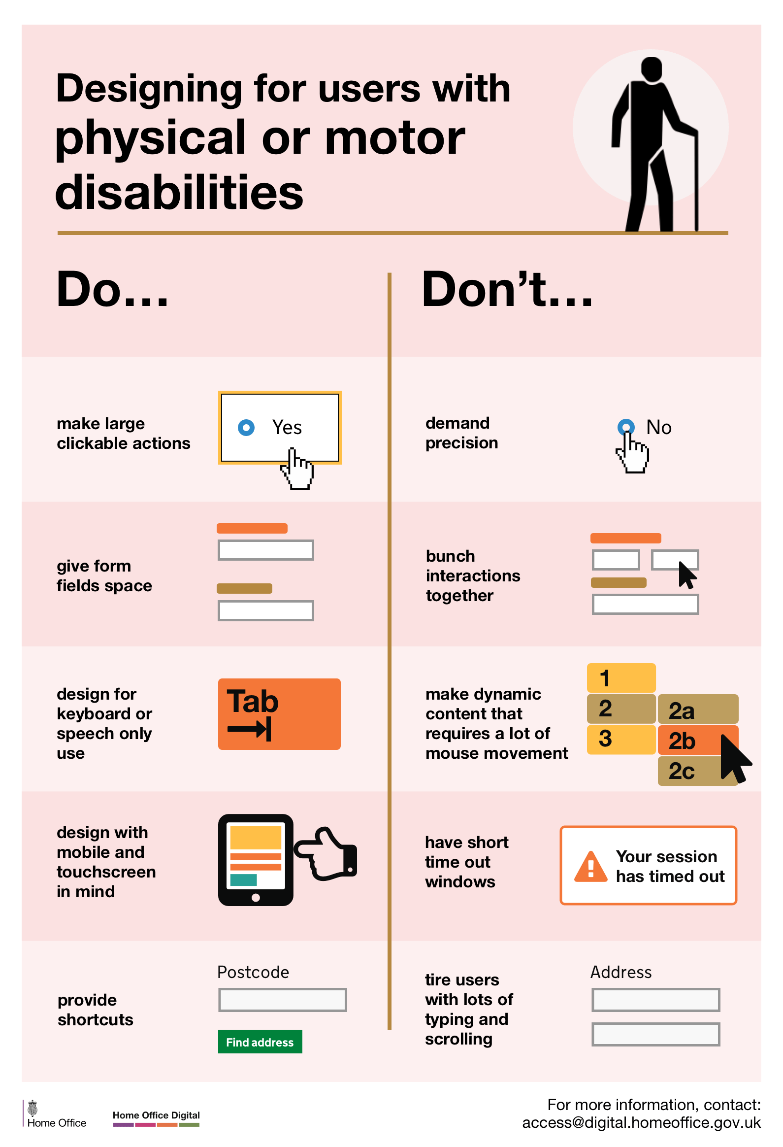
The dos and don’ts of designing for accessibility posters are general guidelines and best design practices for making sites and materials accessible. These posters were originally created by the UK Digital Home Office Digital, Data and Technology and are stored on the UK Home Office’s – GitHub Repository and have a NC-SA-4.0 creative commons license.  Others have modified the posters to cover different users, such as a poster created about designing for users with aphasia, created by the INCA project at City, University of London and funded by EPSRC. Users covered in individual posters are: Screen Reader Users, Low Vision Users, Users with Physical or Motor Disabilities, Deaf or Hard of Hearing Users, Dyslexic Users, Autistic Spectrum Users, Users with Anxiety and Users with Aphasia.

Screen Reader Do

  1. Describe images with and provide transcripts for video.
  2. Follow a linear logical layout.
  3. Structure content using HTML5.
  4. Build for keyboard only use.
  5. Write descriptive links and headings.

Screen Reader Don’t

  1. Only show information in an image or video.
  2. Spread content all over a page.
  3. Rely on text size and placement for structure.
  4. Force mouse or screen use.
  5. Write uninformative links

Low Vision Do:

  1. Use good color contrasts and a readable font size.
  2. Publish all information on web pages.
  3. Use a combination of color, shapes and text.
  4. Follow a linear, logical layout.
  5. Pub buttons and notifications in context.

Low Vision Don’t:

  1. Use low color contrasts and small font size.
  2. Bury information in downloads.
  3. Only use color to convey meaning.
  4. Spread content all over a page.
  5. Separate actions from their context.

Physical or Motor Disabilities Do:

  1. Make large clickable actions.
  2. Give clickable elements space.
  3. Design for keyboard or speech use only.
  4. Design with mobile and touch screen in mind.
  5. Provide shortcuts.

Physical or Motor Disabilities Don’t:

  1. Demand precision.
  2. Bunch interactions together.
  3. Make dynamic content that requires a lot of mouse movement.
  4. Have short time out windows.
  5. Tire users with lots of typing and scrolling.

Deaf or Hard of Hearing Do:

  1. Write in plain language.
  2. Use subtitles or provide transcripts for videos.
  3. Use a linear, logical layout.
  4. Break up content with sub-headings, images and videos.
  5. Let users ask for their preferred communication support when booking appointments.

Deaf or Hard of Hearing Don’t:

  1. Use complicated words or figures of speech.
  2. Put content in audio or video only.
  3. Make complex layouts and menus.
  4. Make users read long blocks of content.
  5. Make telephone the only means of contact for users.

Dyslexia Do:

  1. Use images and diagrams to support text.
  2. Align text to the left and keep a consistent layout.
  3. Consider producing materials in other formats (for example audio or video).
  4. Keep content short, clear and simple.
  5. Let users change the contrast between background and text.

Dyslexia Don’t:

  1. Use large blocks of heavy text.
  2. Underline words, use italics or write in capitals.
  3. Force users to remember things from previous pages (you should give reminders and prompts).
  4. Rely on accurate spelling (you should use autocorrect or provide suggestions).
  5. Put too much information in one place.

Autistic Spectrum Do:

  1. Use simple colors.
  2. Write in plain language.
  3. Use simple sentences and bullets.
  4. Make buttons descriptive.
  5. Build simple and consistent layouts.

Autistic Spectrum Don’t:

  1. Use bright contrasting colors.
  2. Use figures of speech and idioms.
  3. Create a wall of text.
  4. Make buttons vague and unpredictable.
  5. Build complex and cluttered layouts

Anxiety Do:

  1. Give Users time to complete an action.
  2. Explain what will happen after completing a service.
  3. Make important information clear.
  4. Give users the support they need to complete a service.
  5. Let users check their answers before they submit them.

Anxiety Don’t:

  1. Rush users or set impractical time limits.
  2. Leave users confused about next steps or timeframes.
  3. Leave users uncertain about the consequences of their actions.
  4. Make support or help hard to access,
  5. Leave users questioning what answers they gave.

Aphasia is language loss after stroke and other forms of brain injury.

Aphasia Do:

  • Keep text short and simple.
  • Include a text label with every icon.
  • Minimize distractions.
  • Let users control the pace of interaction.
  • Limit the number of steps.

Aphasia Don’t:

  • Use complex sentences.
  • Rely on image or text alone.
  • Clutter the screen.
  • Use timeouts.
  • Use complex user journeys.
Skip to content